Total Pageviews

Thursday 26 January 2012

Production Company Logos

Original Hammers Film Studies
Typeface/font
Jagged font which implies an uneasy feeling. The font is not smooth so this goes well with the horror film, you know its not going to be an easy-watching film.

Colour
Red font, implies danger and blood - ties in well with the horror film. Also a nice contrast with the dull background. The background is of very dark colours which also gives an uneasy feeling and ties in with the horror genre.

Iconography
There is a picture of a unkempt old-looking haunted house. this ties in very well but its not a logo its more of a picture so its not iconic or symbolic.

Layout
Very plain, just writing in the middle of the picture, no specifically good layout.

Framing and composition
Can't see any attention to framing and composition

Lionsgate
Typeface/Font
Solid, metallic font in capitals. Implies its not an easy-watching film or a chic flick.

Colour
Background smoke is red which implies danger or blood.

Iconography
There are no clear images, just smoke which doesn't tie the film company down to one certain thing but maintains the mysteriousness of the company.

Layout
Just the title in the middle, doesn't distract the eyes anywhere else so its clear who the company is.

Twisted pictures

Media Institutions Research

Activity One:

US films
Horror film one: "The Devil Inside"
Production company: Paramount Pictures http://www.paramount.com/
Paramount Pictures makes a variety films, from family to horrors. Some of it's films include "Hugo" and "Star Trek". The logo is a mountain, reflecting it's name "mount", showing that it's films are high class and epic, they're of a big scale- like a mountain.

Horror film two: "Prometheus"
Production company: Mutant Enemy Productions
http://en.wikipedia.org/wiki/Mutant_Enemy_Productions
Mutant Enemy mainly makes T.V programs such as "Buffy the Vampire Slayer". From the logo we can see that they make mutant programs and productions because of the monster on the logo.

UK films:

Horror film one: "The Awakening"
Production company: BBC Films, StudioCanal UK, Creative Scotland
http://www.studiocanal.co.uk/
This logo does not indicate that it makes horror films, it's very simple and professional which indicates a range of films to not favour a particular genre.

Horror film two: "The Descent"
Production company: Celador films, Northmen production

There is no logo for these production companies.

Celador films makes a range of films from action to horror but they also make T.V productions.
The budget for "The Descent" is very low at only £3.5 million.


Thursday 19 January 2012

Props

These are the props we will be using in our film:
An old, wooden rope swing for our flashback scene.
A Ouija board for the beginning, this is essential for preparing the audience for the rest of the film.

Map and Location

LOCATION


This is a satellite view of the church/ graveyard we will be using to film one of the flash backs of a funeral.

MAPS

This is the route between the two locations we will be using. As you can see they are quite close together as the church is a local church in our area. We will be walking as its very close. 

Thursday 12 January 2012

Previous student marking

SANATORIUM


-Material appropriate for target audience and task as it's very scary and leaves you on a cliff hanger.
-fitted titles in really well with the action as it's not boring to watch because they are showing you randoms images related with the film too.
-Music was very good as it fitted in with the imagery very well and reflected the emotion that the characters are feeling. It also made it look very mysterious and didn't sound cheesey. Loved the news clips at the start.
-Very professional use of camera work. Location created a good mise-en-scene as its very empty and appropriate.
-The news clip at the start made the storyline much more easy to understand.

60/60

HAMILTON COURT


-Used a variety of camera shots which made the imagery more interesting.
-There was alot of repetition as far as sound is concerned but it was appropriate sound.
-Storyline wasn't that creative.
-Good location, empty, vulnerability.

40/60

LIGHTS OUT

-The imitation of a newsreader was good.
-The continual screeching sound and continual use of same music wasn't effective as it didn't highlight any mood because it was just a constant sound.
-I liked the location as it reflected the 'lost' sort of feel.
-'The CCTV camera highlighted that someone was watching him which was extremely affective.

45/60

FEAR GROUND

-I don't like the music at all, it relates to the theme but it doesn't sound like music you would put in a horror film.
-Like the contrast between the light scenes and the dark scenes.
-I like the iconic clown figure, it sticks in your head.

48/60

VIDEO EVIDENCE.


-Not easy to understand

Storyboard


This shows a storyboard of how we want our shots to look. This will help us create the film shot by shot.

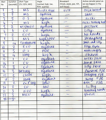
Shot list

Reccee sheet


Test shot


This is a makeup trial test shot of the murdered girl who will appear right at the end. This is the only character who will be wearing noticeable makeup, all the rest are wearing neutral makeup. 

Film outline


This is a rough outline of our film which we used to demonstrate our varied shots and angles of the camera to add to our shotlist. 

Reccee Sheet


This is a reccee sheet of the place in which we will shoot our flashbacks. This is the only reccee sheet we did because the other shots will be at Emmys house, therefore we don't need permission.

Production Schedule


Opening title sequence


This is our plan of the opening title sequence

Other students' work-marking

The video being analysed

Strengths:

  • Appropriate camera angles and shots 
  • Great location
  • First scene establishes character very well
  • Simple but interesting story line
  • Good costumes, suitable to location and character

Weaknesses:
  • Not very believable 
  • Dark lighting


Strengths:
  • Appropriate music that adds tension to the scene
  • Good costumes, allows the story to be believable
  • Good use of props
  • Good use of angles, high angles make subject look vulnerable
Weaknesses:
  • Hard to work out who the threat is through his costume and make up
  • Lighting quite dark

Previous students work - marking

http://www.youtube.com/watch?v=gMRbsnHIuxI&feature=plcp&context=C319370cUDOEgsToPDskK-omF7H311IQDIaar1tvPu

Strengths:
-Editing is very good, very precise continuity editing which clearly highlights the threat.
-The special effects at the beginning are creative and it is an inventive way of doing the opening titles.
-They used the location and setting very well because downstairs when everything is calm it looks homely where as upstairs they used dark lighting and plain white walls to portray a sense of emptiness and highlighting the threat.
-They used simple but effective costumes as the girl is in normal everyday clothes and the boy as a plain black hoodie on. This is very current and effective because it creates a contrast with his pale face.


Weaknesses:
-The lighting is sometimes quite dark so facial expressions aren't very clear, however this could highlight the scary atmosphere.


http://www.youtube.com/watch?v=38xV9Bhf-Cc&feature=context&context=C319370cUDOEgsToPDskK-omF7H311IQDIaar1tvPu

Strengths:
-Immediately it catches my eye as the title 'reflection' has been reflected and looks very professional. The background image is very dull grey smoke which instantly initiates the genre of the film.
-I like the slow pace of cuts at the beginning as it keeps the atmosphere very calm.
-Also a good range of shots with many ECU to highlight the threat.

Weaknesses:
-Evident that they films the scene in the woods different times in the day because it suddenly got dark in certain shots so the continuity isn't constant.

Wednesday 11 January 2012

Lighting videos


Key lighting:
There will be a slight shadow across the subject as it is placed at a 40 degree angle. It is the main source of light.
Fill lighting:
It's used to fill in the shadow cast by the key light.
Back lighting:
This is used to make the subject stand out from the background and is placed behind the subject to lower the intensity.

Make-Up video technqiues.


This video has inspired us to create a zombie-like character who looks dead and frightening. From this we have taken the white lips method in order to ensure our character looks like a corpse or possessed. The dark eye shadow method will also be incorporated in our look as it suits our character correctly.

Initial idea

Plot overview:

  • 4 girls at a sleepover
  • One of their friends died a while back
  • One of them killed her by strangling her
  • They want to play ouija board but murderer doesn't
  • Flashbacks of girls death, funeral and an empty rocking swing
  • Ouija board reacts to murderer
  • Strangled girl appears behind her 
  • The scene fades to black
  • A new family moves into the now haunted house

Thursday 5 January 2012

Script


INT. SAMS HOUSE – SAM’S LIVING ROOM – NIGHT


LILLY SMITH, SAM MARIGOLD, NICKI COOK in living room circling around an Ouija board all excited except LILLY (murderer). All wearing pyjamas.
                                
SAM

(giggling)
Okay, calm down now my parents might hear you know how they feel about me doing this, they don’t even know I took this.

NICKI

Yeah, come on lets do this properly. I wanted to contact Blair, its been a year since she left us.
(sits, legs crossed with eyes closed about to chant)

LILLY

(breaths heavily)
I-I don’t think this is a g-good idea, ghosts don’t exist, especially not Blair. I- er we can’t relive the memory of her dying.

Half a second flash of BLAIR being strangled.

SAM
I’m scared too Lil, but she was one of us, think of it as a form of closure.

LILLY
(panicking)
You don’t understand, I-I..just.. can’t do this.
(starts to leave)

NICKI grabs LILLY’S arm aggressively and begins to chant.

NICKI
Spirit please come forward and give us guidance.

SAM, NICKI
Spirit please come forward and give us guidance.


Spirit please come forward and give us guidance.
(This is said all through the flashbacks)

NICKI

(whispers)
Blair
Blair
Blair

(Flash back one: SAM, NICKI, and LILLY at BLAIR’S funeral. Shot of them crying, closer up of Lillys face showing her looking guilty.)
(Sounds of girls giggling, along with the sound of the girls still chanting)

(Flash back two: LILLY strangling BLAIR.) 

LILLY

(shout)

I’m sorry, but this has to be done we’re better off without you!

BLAIR 

Lilly NO!

(screams)

(Flash back three: Two shots of a swing, one with BLAIR on the swing and then she suddenly disappears)

(Screeching noises from the swing added to the girls laughter and the chanting)

(Flash back four, all four girls laughing and joking before she dies. More Laughter is added.)

(Back in the living room again, we see a close up of Lilly’s face as she comes out of her flash backs. LILLY is heavy breathing)

(We see an extreme close up of LILLYS hands as blood begin to pour out of them) 

LILLY 

(screams)

IM SORRY!

(See BLAIR come behind LILLY and strangle her)

Censorship Research Assignment

Activity One: Initial Research Questions
Q1. The BBFC censors films in the UK.


Q2. The cinema, the supermarket and video rental stores ensure that access is restricted to certain films.
Q3. If the cinema allows access to an 18 film to somebody underage they can be given an official warning or fined.
Q4. Some film companies would ask specifically for an 18 certificate because it makes the film appear edgier and scarier, those eligible to watch are more likely to see it because of this appearance. Also, there have been many complaints as with lower ratings the younger audience may ruin the film for others by coming in large groups and being noisy and disruptive.

Activity two: Horror Censorship Research
1. The Grudge 2
'The Grudge 2' has a certificate of 15, this rating was given as the BBFC says it contains "strong supernatural horror and threat" which a 15 year old would be able to understand isn't real plus the film does not show violence or gore.

2.The Skeleton Key
"The Skeleton Key" was given a 15 rating by the BBFC due to scenes of "infrequent strong violence and sustained menace" as a younger audience may feel encouraged to act violently whereas a slightly older audience would be more mature and have a better understanding.

3. Saw

The certificate for "Saw" is an 18 due to "strong bloody violence language" as throughout "Saw" there are scenes of very realistic gore which younger audiences may be too sensitive to view.

4. "Wrong Turn"

The rating for "Wrong Turn" is an 18 because it features "strong bloody violence and horror". The theme of cannibalism runs throughout which is a sensitive topic younger audiences won't understand.

5. "Wolf Creek"
Due to it's use of "strong bloody violence and very strong language" this film has a rating of 18. It is becoming clear now that strong violence and language are factors which make a 15 an 18 because of their unsuitability for younger audiences.

6. "Final Destination"

"Final Destination" was given the rating of a 15 because of "strong language and horror", despite some gore the film is not disturbing enough to give it an 18 rating.

7. "Blair Witch Project"
This film uses "strong language and horror" to scare it's audience giving it a 15 rating.

Tuesday 3 January 2012

Production Schedule: Casting, Location and Equipment List

Actors:


Actor one
Name: Ivana Talbott
Telephone number: 07815701255
Email address: ivanatalbott@hotmail.com
Cast role: One of "sleepover girls"
Dates required for shoot: 18/2/2012


Actor two
Name: Jade Talbott
Telephone number: 07432128696
Email address:
Cast role: One of the "sleepover girls"
Dates required for shoot: 18/2/2012


Locations
Location one: Ivana Talbott's house
Address: 55 Melford Road Bilborough Nottingham NG8 4AP
Date and Time of Shoot:
Transport Details: Walking distance

Location two: Emmy Brown's house
Address: 28 Darnhall Crescent Bilborough Nottingham NG8 4PY
Date and Time of Shoot:
Transport Details: Walking distance

Location three: St. Martin's Church
Address: St. Martin's Road Bilborough Nottingham NG8 3BH
Date and Time of Shoot:
Transport Details: Walking distance/Car

Equipment
Make-up:
Black eye shadow
Very light/pale foundation 
Props/Costume:
Ouija board
Pyjamas